Case #BCD-2013 · Financial Services · Barclays Bank Delaware
Barclaycard
Barclays Bank Delaware established an internal design department called the Technology Innovation Lab — delivering agency-quality work at the speed of a product team.
Rather than outsourcing design to agencies, Barclays built an internal lab that sat close to both business and engineering. The mandate: deliver high-end, thoughtful design at the pace and cost that only in-house teams can achieve.
My work spanned three distinct product areas — each with its own audience, problem space, and set of constraints. There's no single arc here. What follows is a collection of screens across three parallel workstreams.
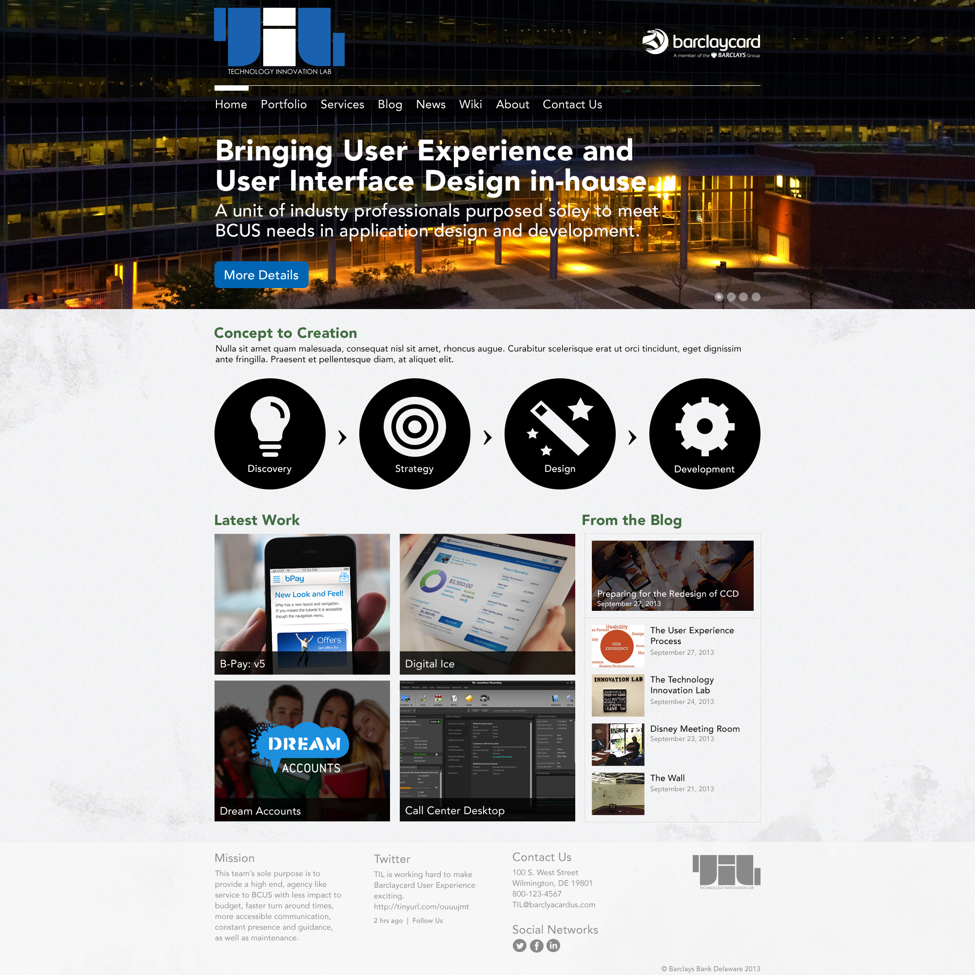
The Technology Innovation Lab — high-end design services built inside Barclays.
A mobile payment experience built around daily use — with rewards that made spending with Barclaycard feel like a habit worth keeping.
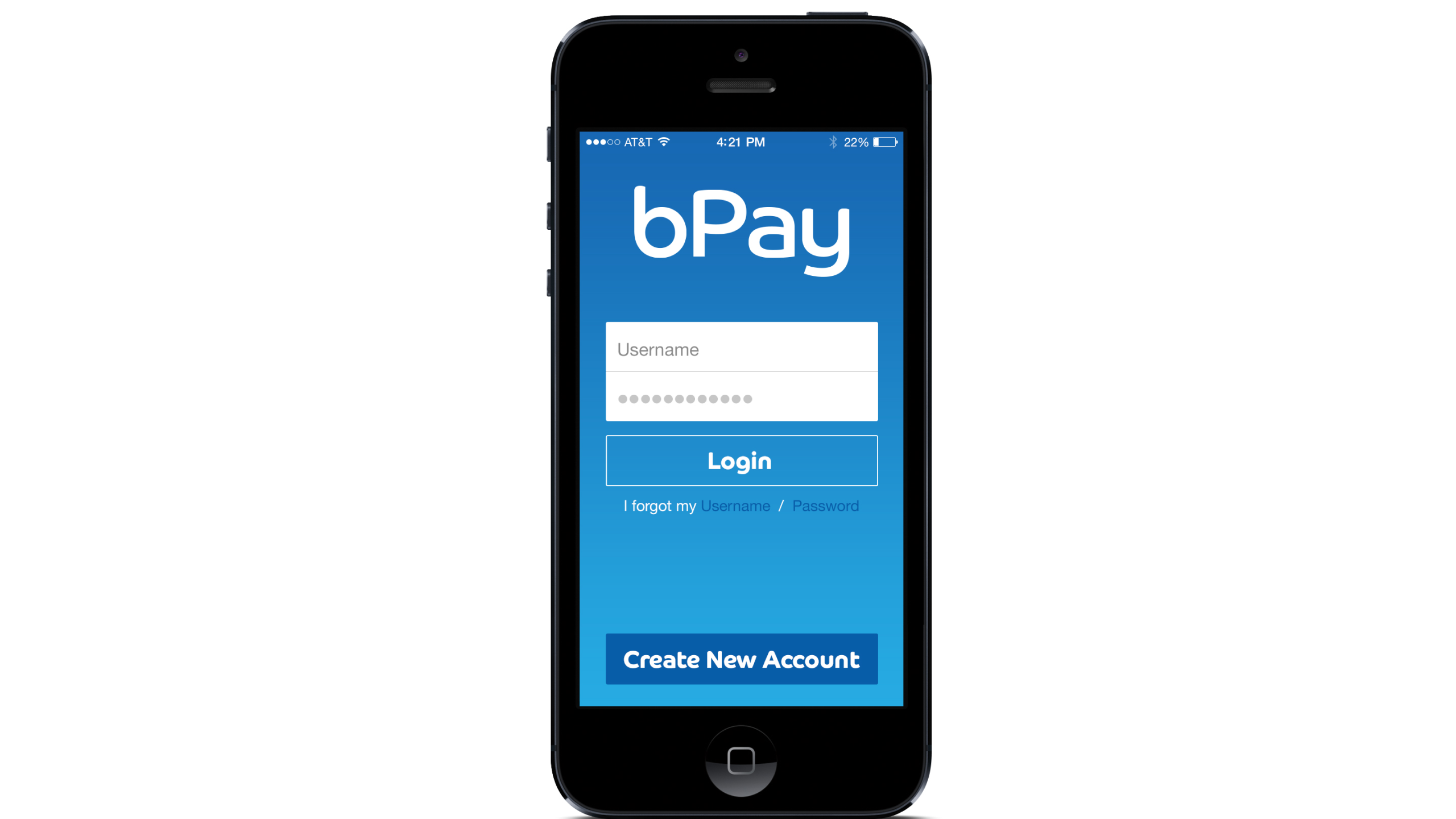
bPay was designed as a rewards-driven mobile payment application encouraging cardholders to make Barclaycard their card of choice for everyday transactions. The challenge was building an experience that felt lightweight enough to use constantly, while surfacing rewards progress in a way that actually motivated behavior change.
The interaction model needed to feel closer to a loyalty app than a banking app — frictionless payments, visible progress, and moments of delight when rewards were earned or redeemed.
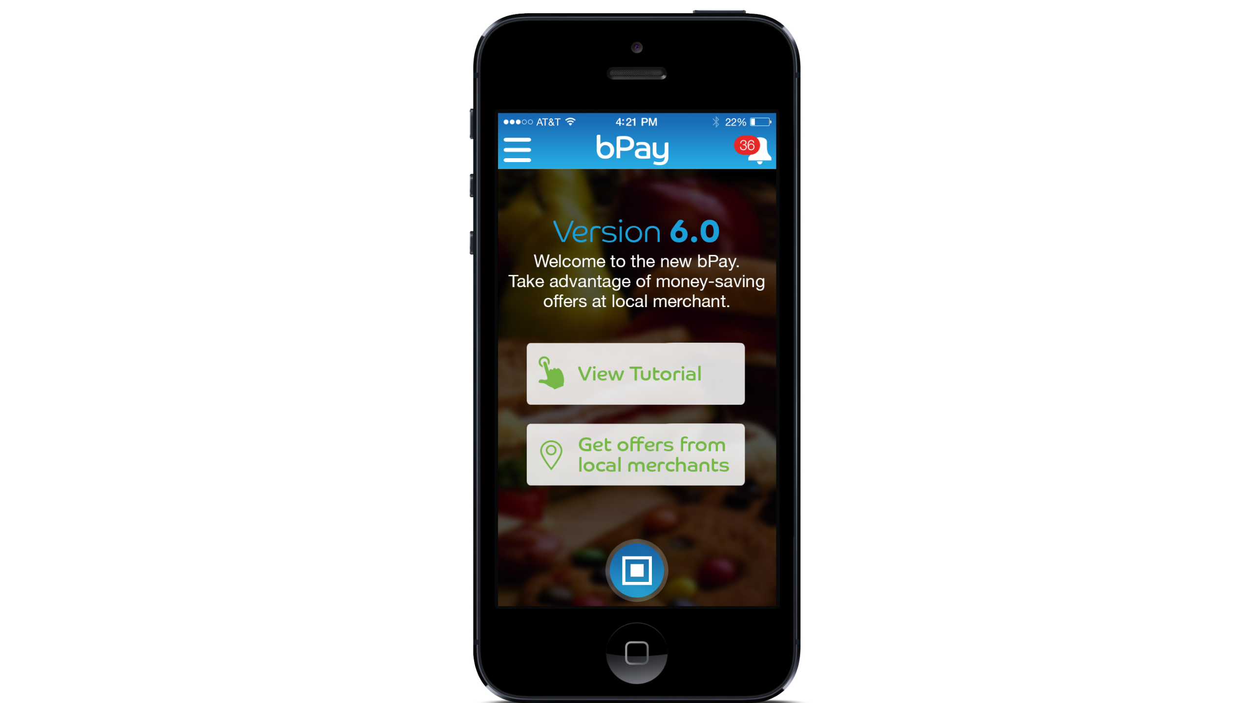
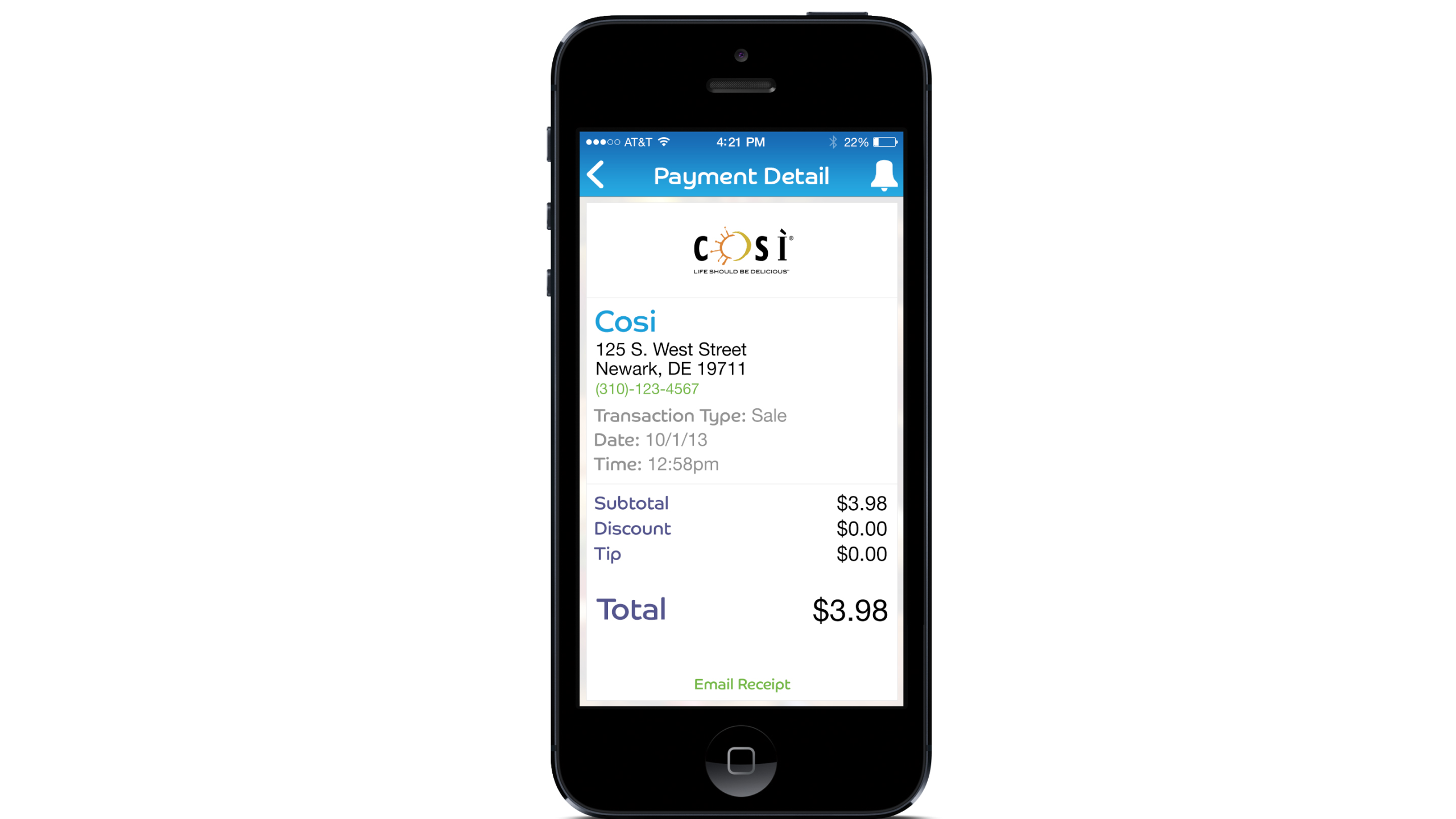

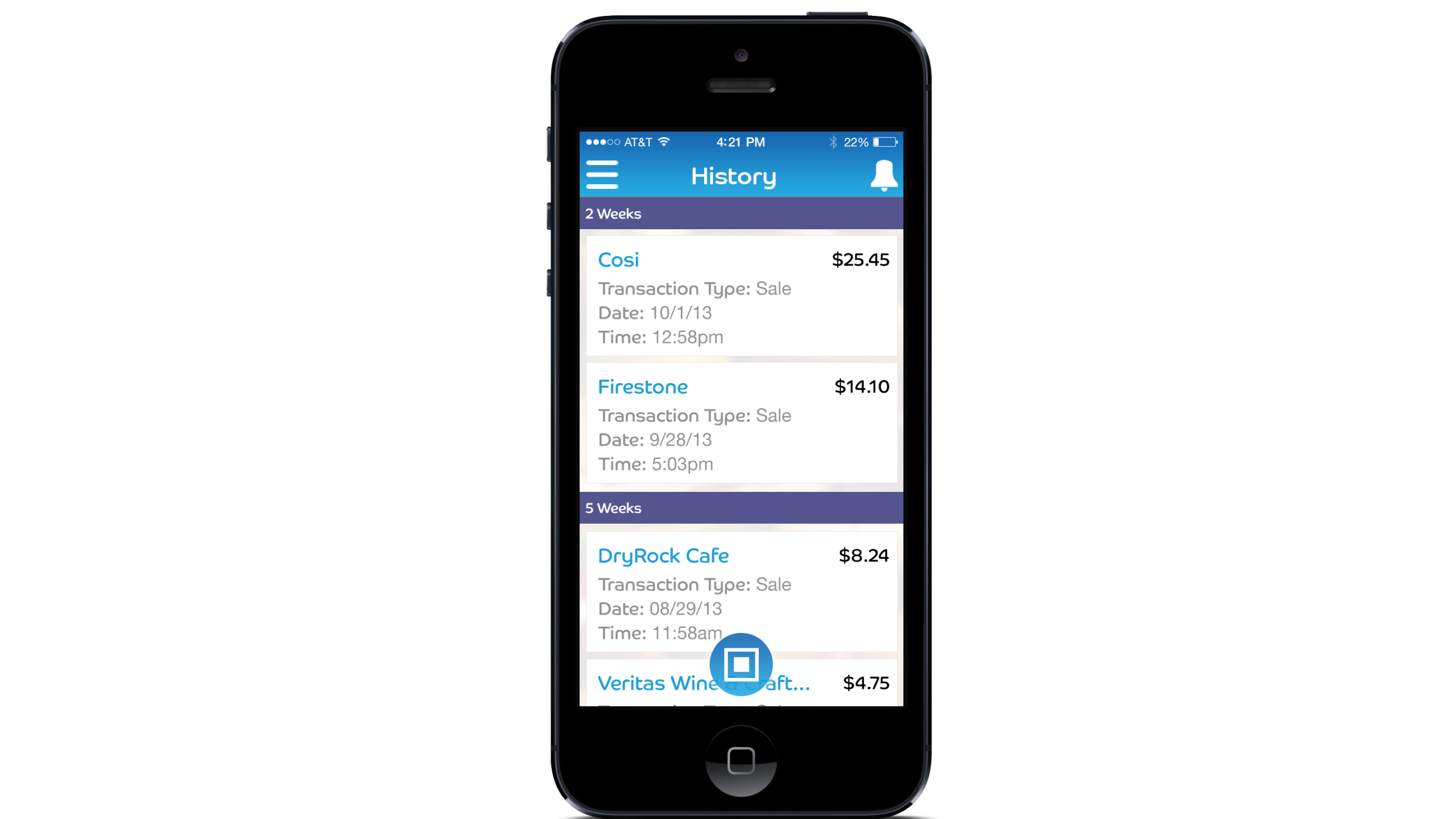
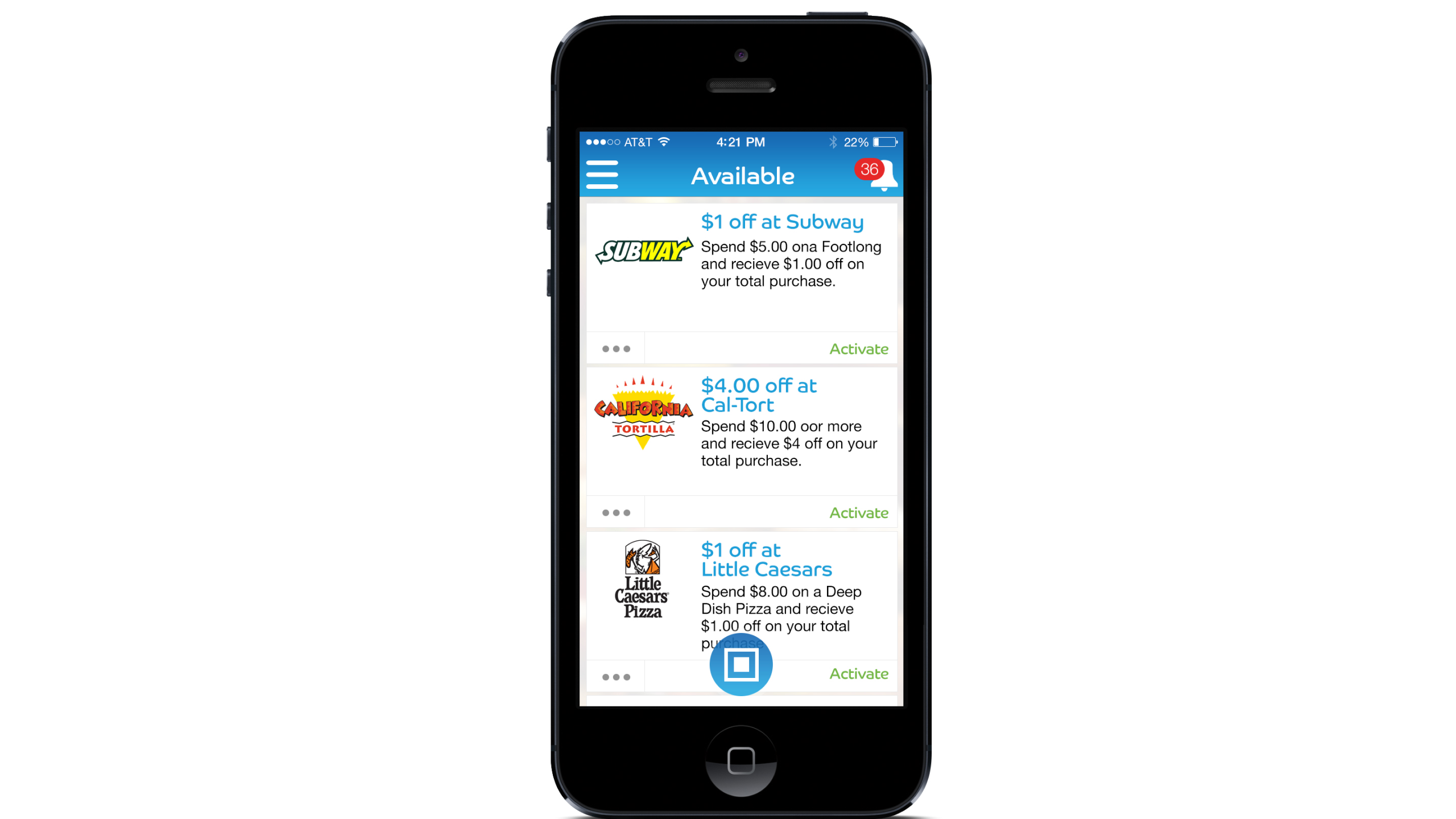
Customer-facing interfaces that made core banking tasks intuitive — reducing friction where cardholders needed clarity most.
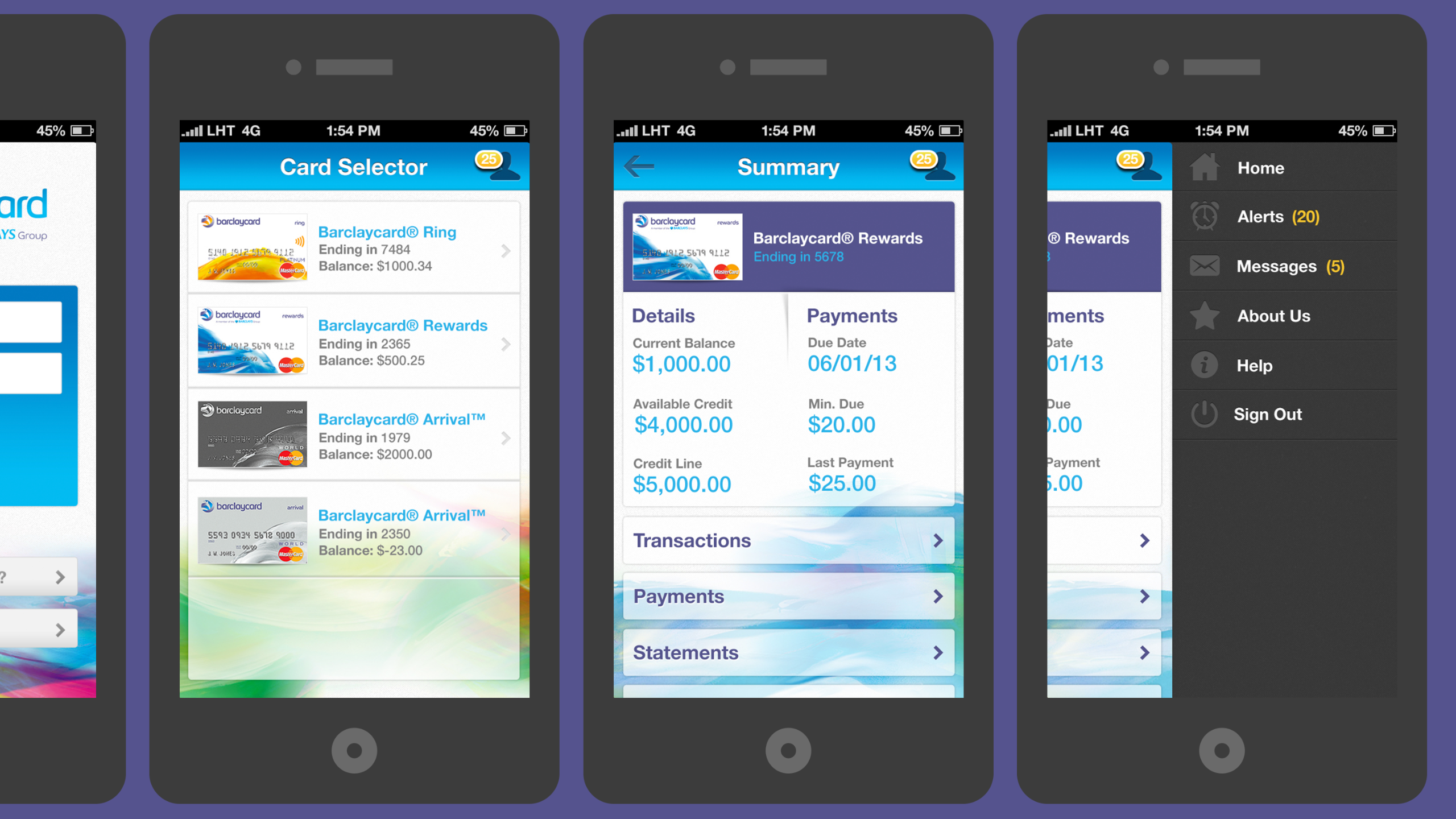
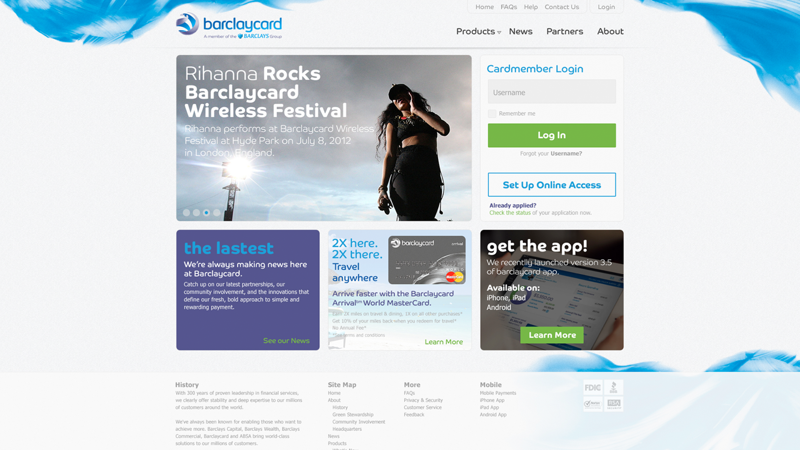
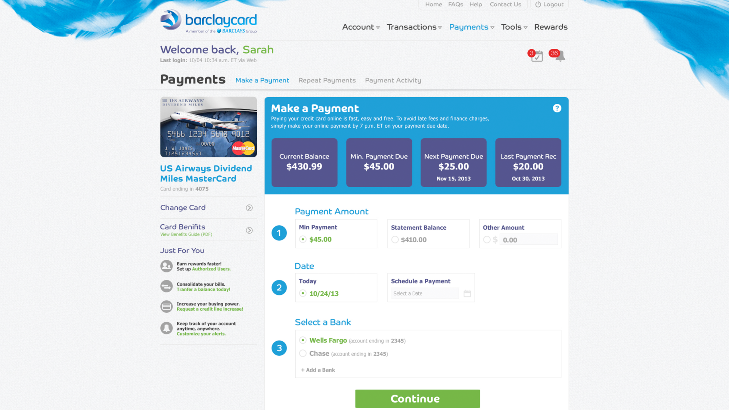
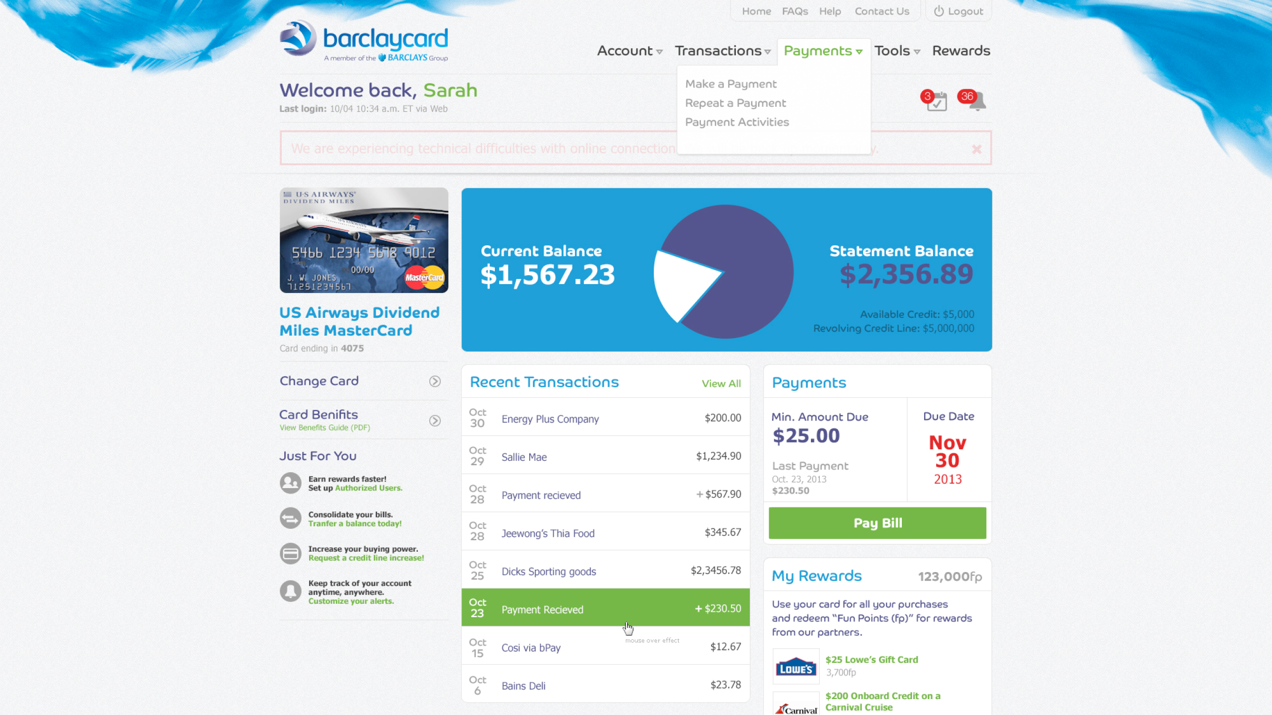
Account management was the functional backbone of the cardholder experience. These screens handled the critical moments — payments, statements, dispute management, and profile settings — where confusion had real consequences.
The design challenge was clarity under constraint. Banking products carry legal, regulatory, and legacy data requirements that resist simplification. The work here was finding where usability could genuinely improve without compromising accuracy or compliance.
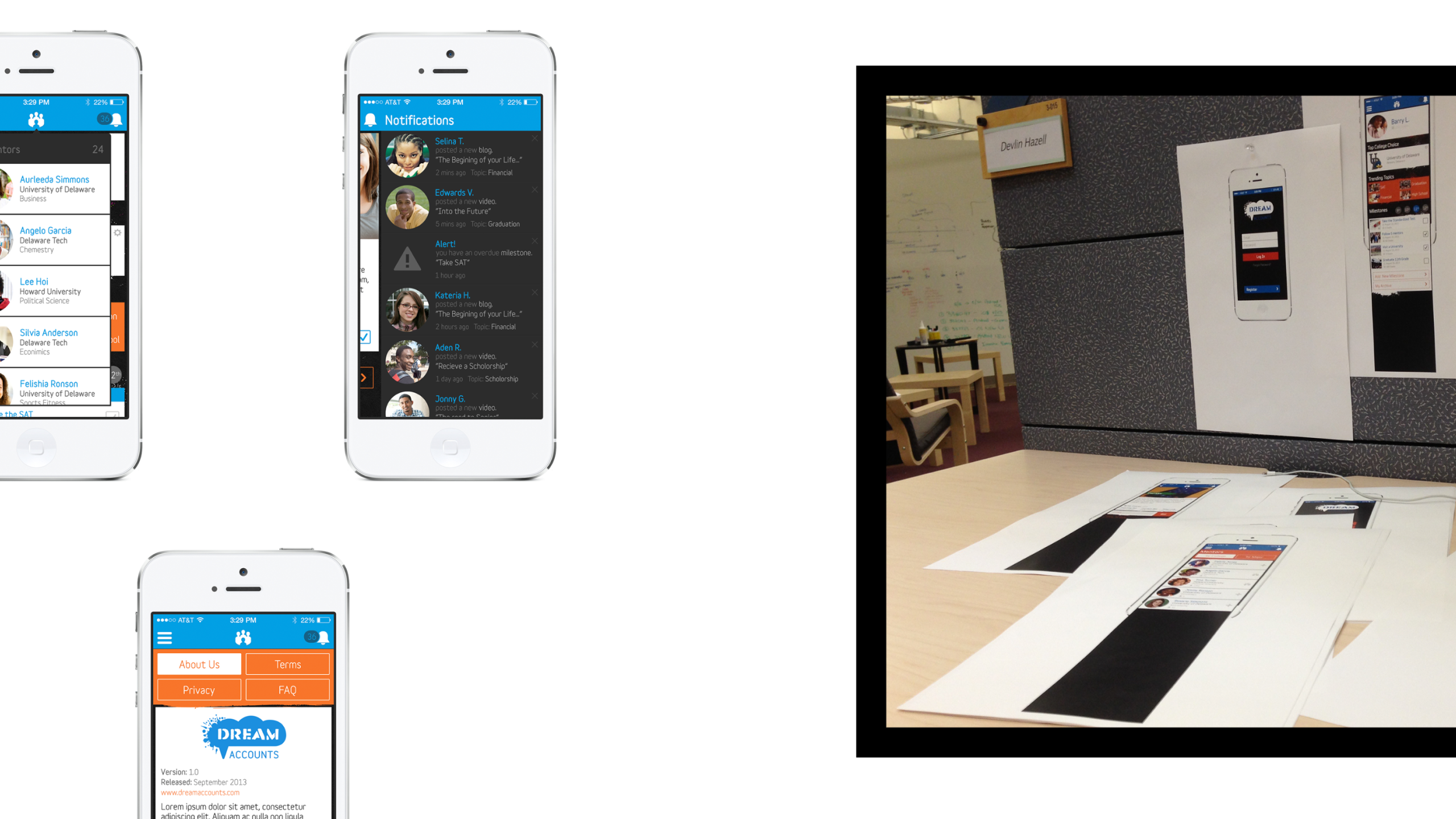
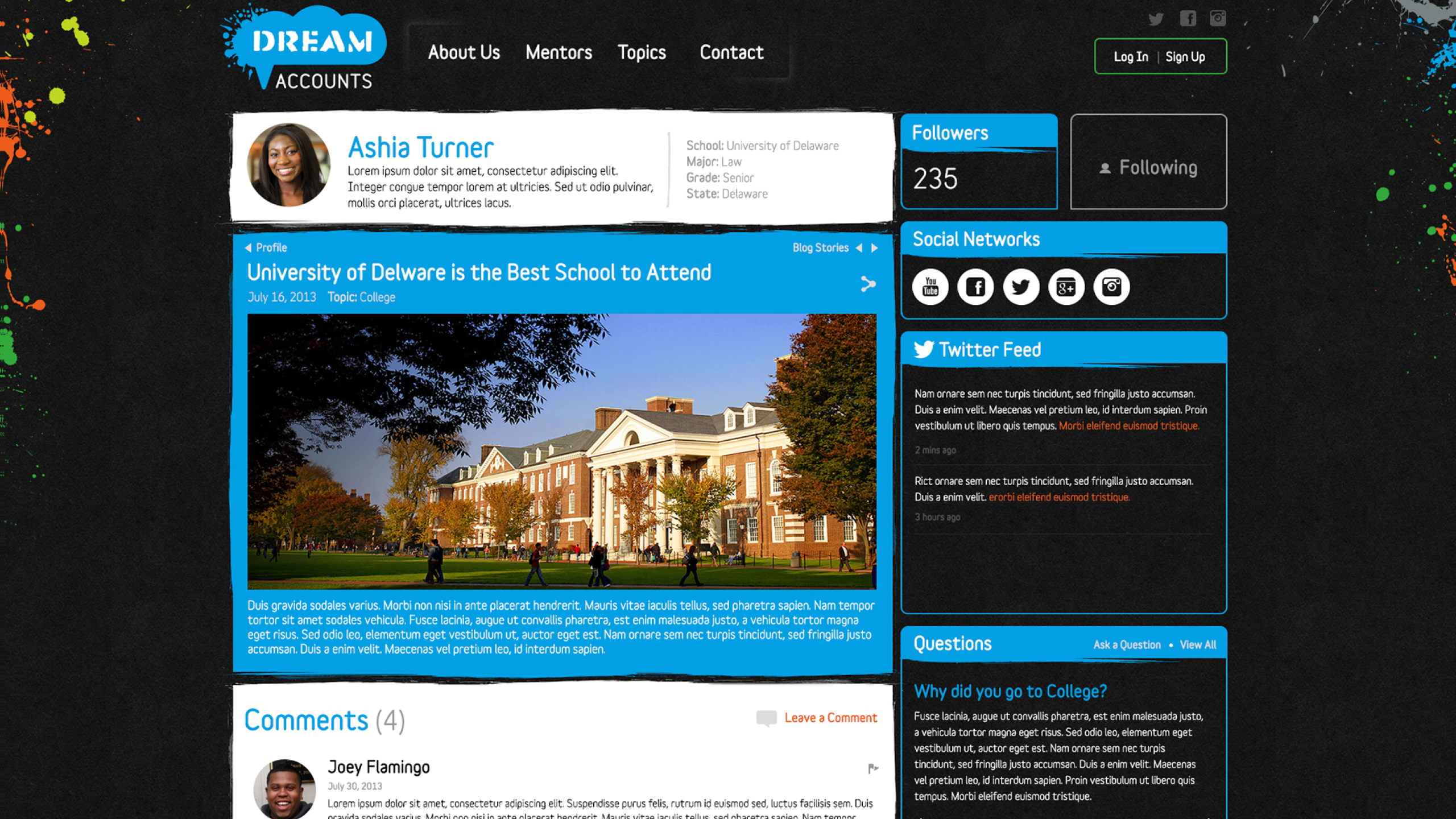
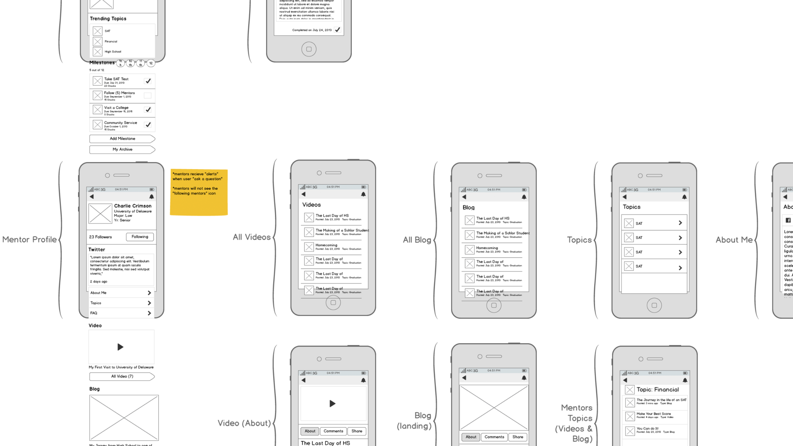
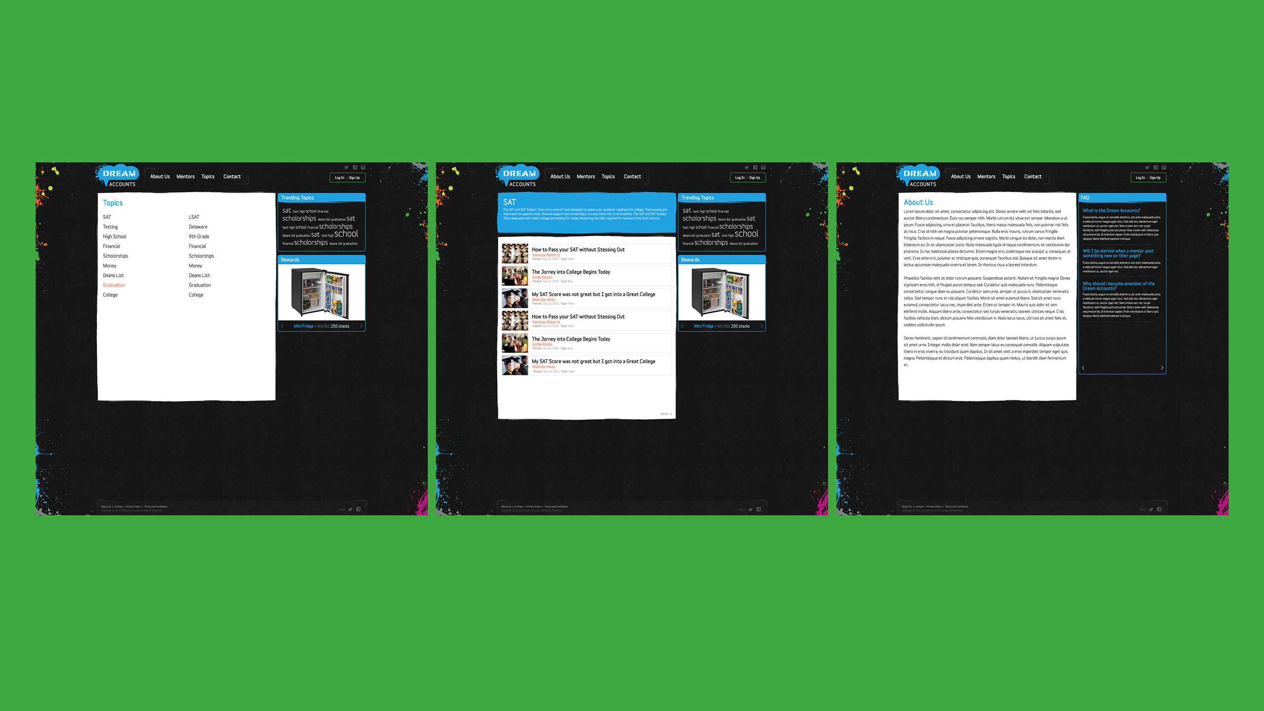
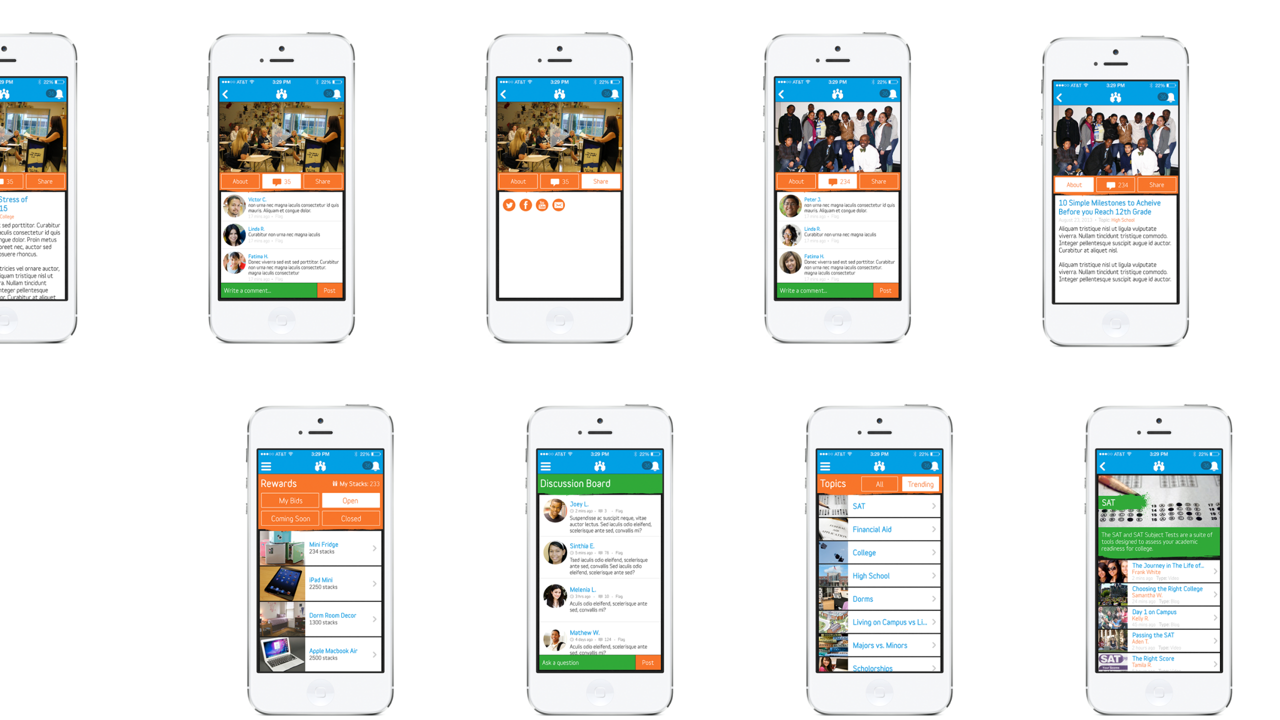
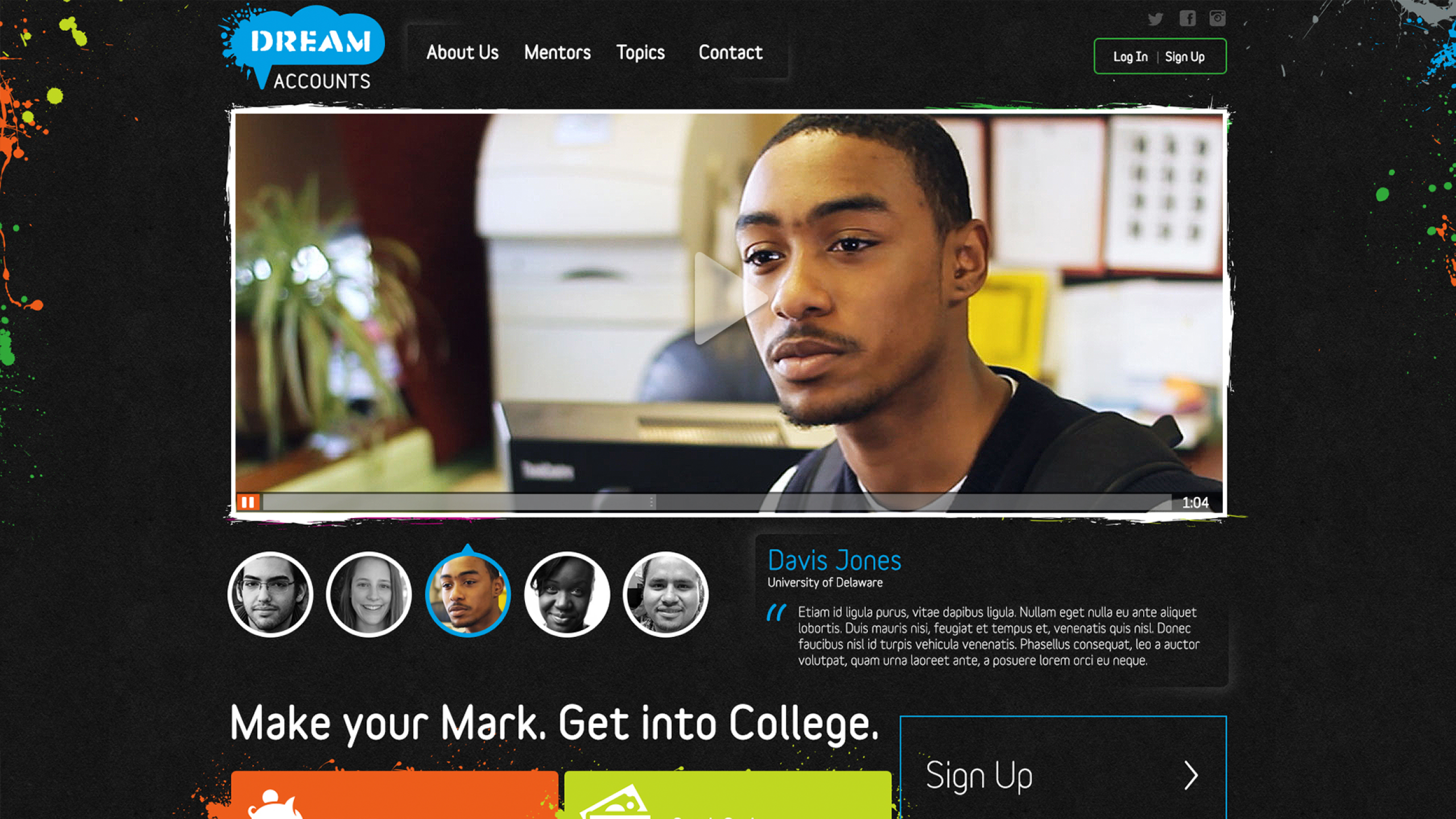
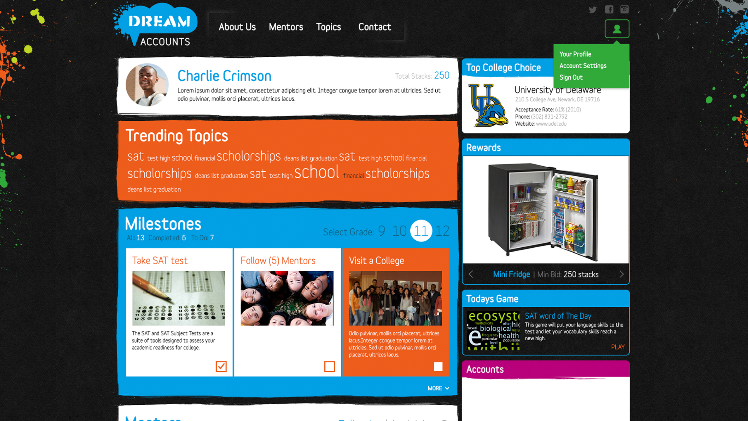
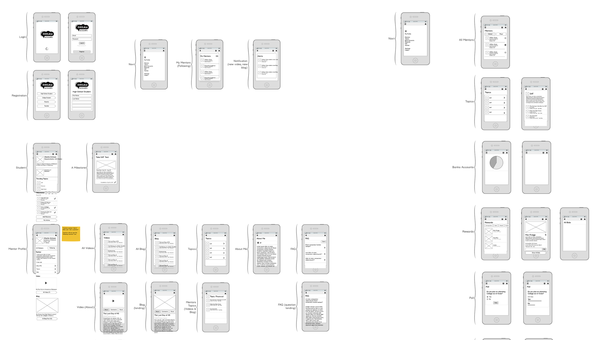
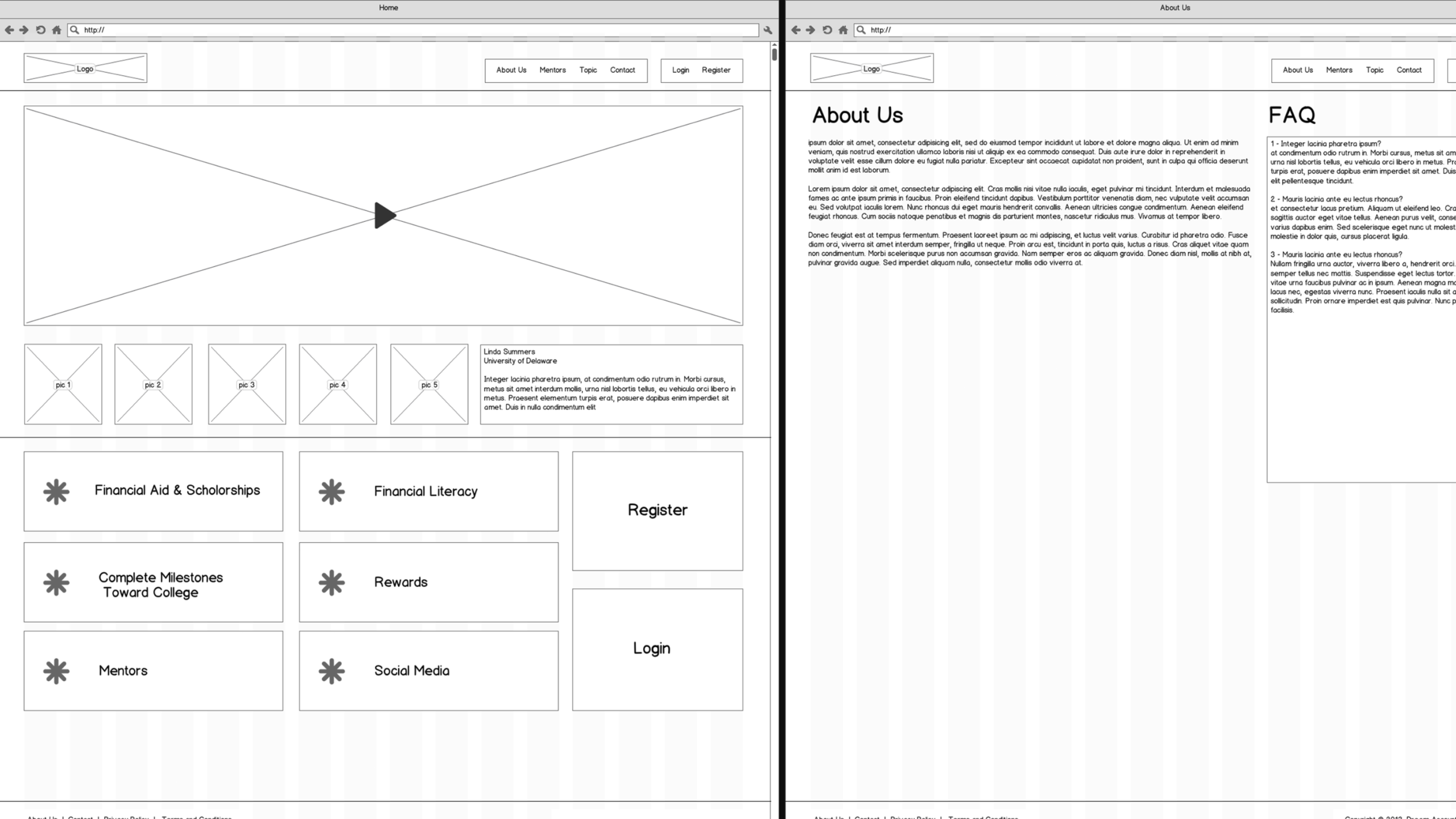
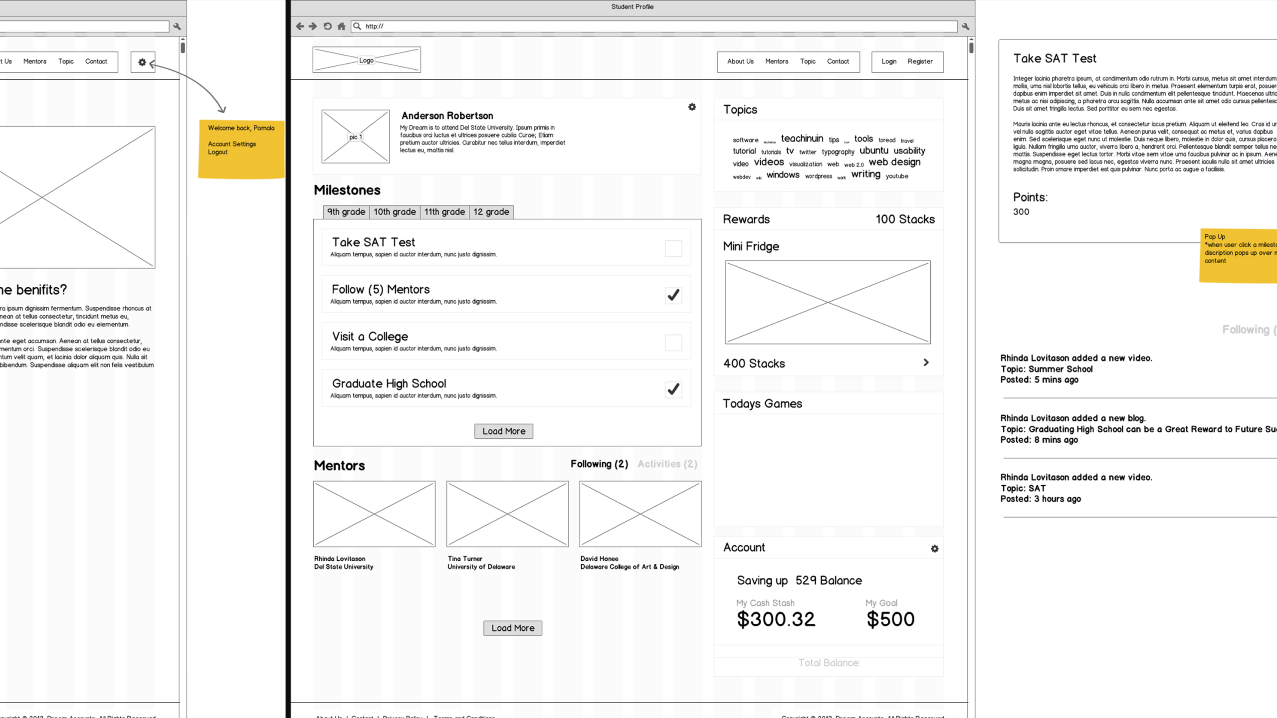
A financial literacy initiative for high school students — designed to make planning, saving, and understanding money feel achievable, not overwhelming.
Barclays built this platform to reach future customers before they ever opened a card — and to do something genuinely useful in the process. The audience was high school students with little to no prior exposure to personal finance.
That audience constraint shaped every decision. The experience needed to communicate complex financial concepts without condescension, and present real-world planning tools — budgeting, goal-setting, credit basics — in a format that felt engaging rather than instructional.